4 October 2023
Deliver a flawless Black Friday CX: How to identify and eliminate your e-commerce UX friction points
Within the realm of e-commerce, the concept of “friction” can be characterized in various nuances, yet all interpretations converge on its detrimental impact on your business. Friction encompasses elements that complicate and intensify the challenges faced by users when navigating the purchasing process on your website.
Succinctly put, it encapsulates any factor that hinders a seamless and pleasurable user journey.
With different audiences and heightened purchase intent, it becomes imperative that your customer experience (CX) is not just optimized but purposely designed to address common Black Friday customer concerns proactively and eliminate UX friction points.
Tackling user friction with proven strategies
User friction is essentially a challenge of discovery: it exists, but uncovering where, why, and how it affects your product is essential for optimizing the user experience (UX) and smoothing out those rough edges.
Product teams can employ usability principles and product usage analysis methods for drop-off and friction areas. By implementing the following strategies, to identify and eliminate UX friction points, you can uncover and address user friction more effectively, ultimately enhancing the user experience and product performance.
At Spell & Sell, a pivotal component of our comprehensive suite of services lies in our technical and UX audit. This essential process serves as a guiding light for brands seeking to enhance their digital presence and user experience. Through meticulous analysis, we assist brands in pinpointing critical UX friction points that may hinder their online success.
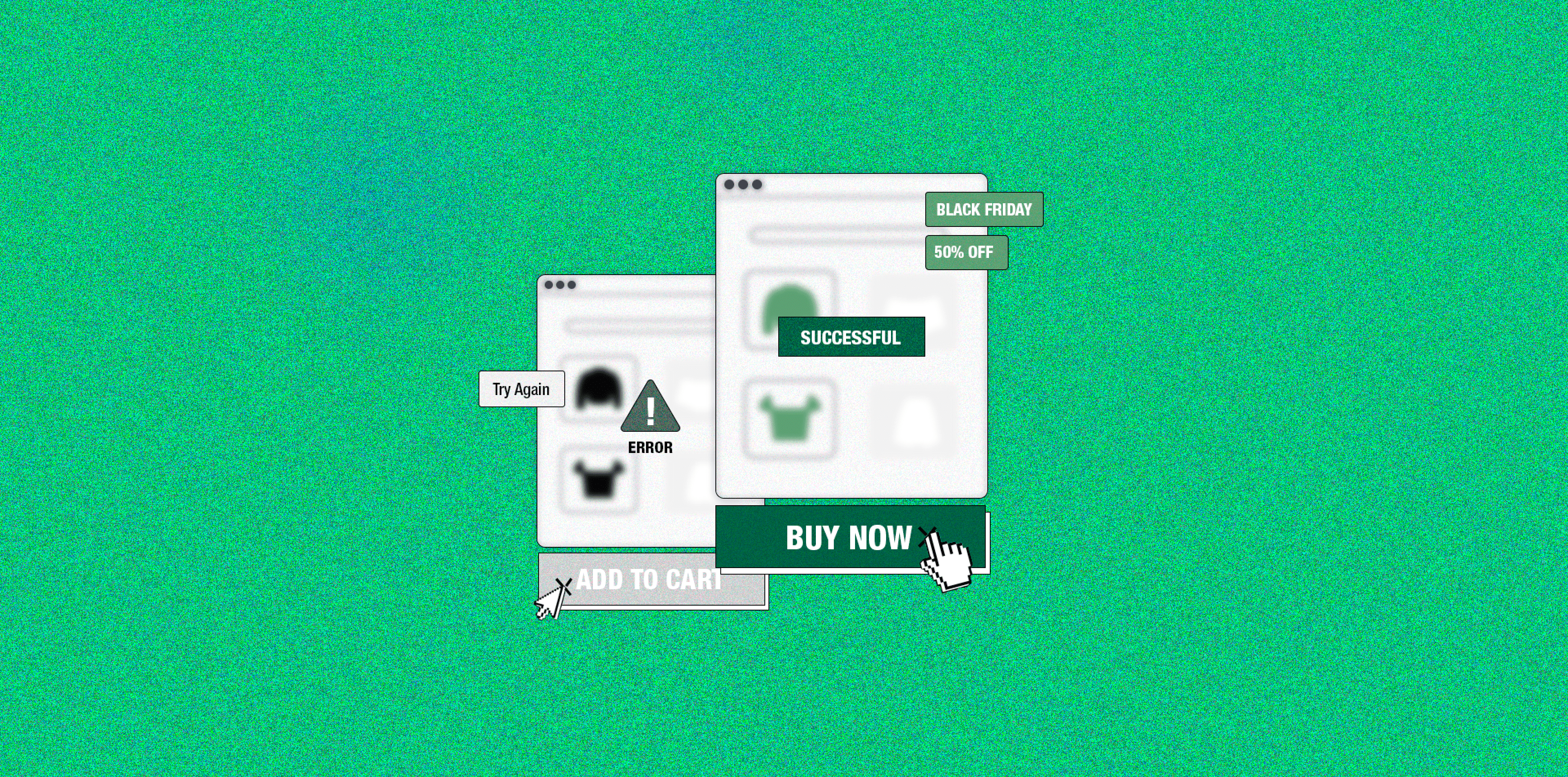
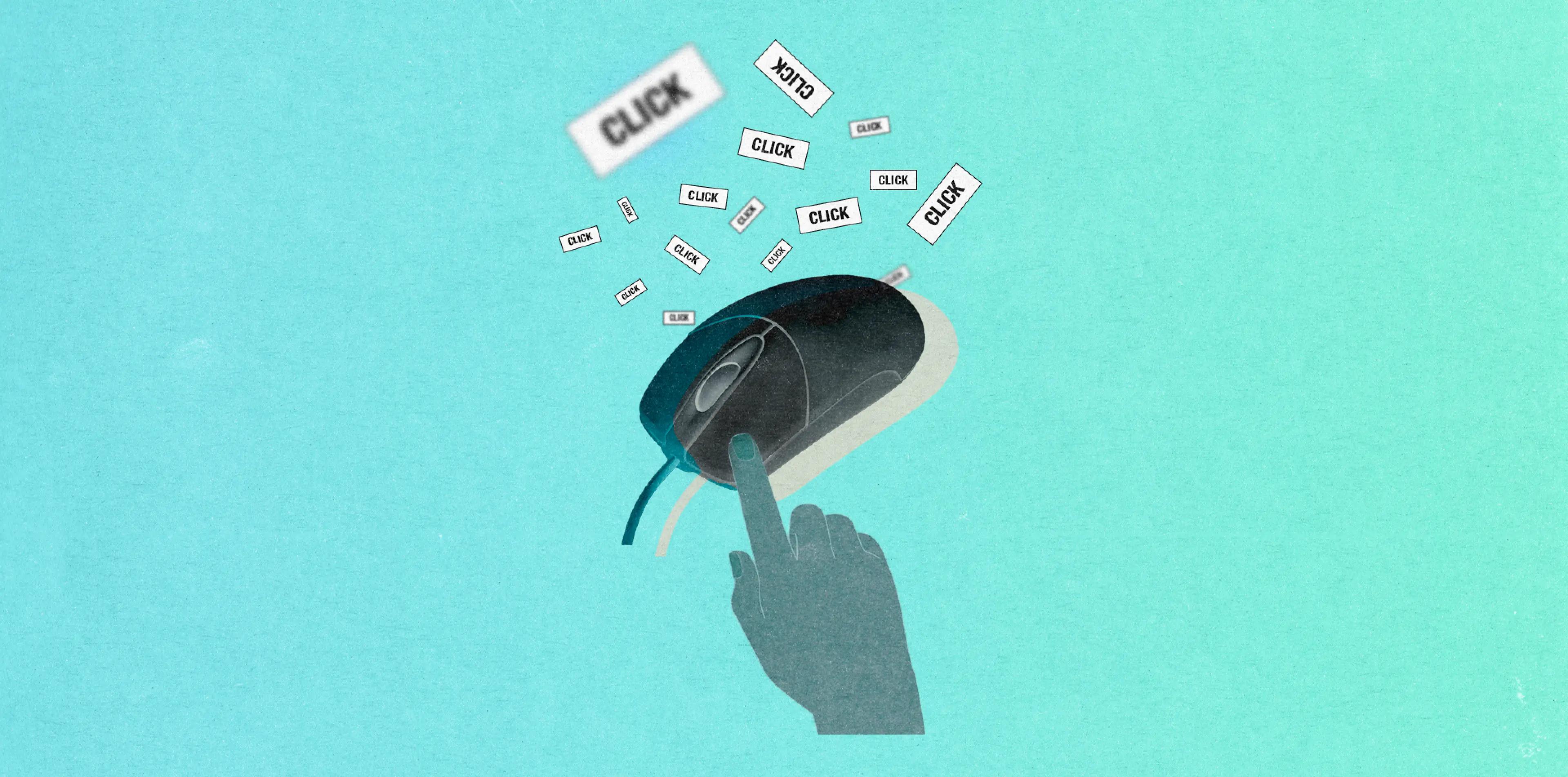
Rage clicks
Identify - Users often exhibit frustration by repeatedly clicking when they can’t achieve their goals due to unresponsive buttons, system delays, or slow loading times. Excessive clicks can harm your website or app.
Eliminate - Utilize click tests to analyze user interactions and usability. Identify instances or repeated clicks to spot user dissatisfaction and issues. This helps the UX design team and developers to analyze how users interact with the UI design and what can be done to fix the specific friction.
Poor navigation
Identify - Identifying poor navigation on a website or app involves assessing user behavior, conducting usability testing, and analyzing user feedback. Look out for signs like a high bounce rate, low average session duration, or user complaints about difficulties in finding information.
Eliminate - Optimize navigation using tools like search bars, breadcrumbs, filters, sorting, and categories to enhance user experiences. Consider user testing methods like cart sorting to better understand how users access content on your website. This valuable insight with enable designers and developers to refine navigation and meet user needs.
Inconsistent design
Identify - The key to a great UX design lies in maintaining design consistency, yet many UX designers overlook this crucial aspect, leading to user friction and usability problems. Users seek straightforward interfaces that require no learning curve. Simple, user-friendly design elements enhance interactions and eliminate confusion.
Eliminate - Establish a strong visual hierarchy for design consistency. Employ uniform fonts, sizes, buttons, and labels to enhance visual coherence, boosting product predictability and user confidence. Additionally, integrate familiar design patterns to ensure a seamless user journey, reducing surprises. Consistency in typography, colors, spacing, size, layout, and patterns enhances product usability and learnability.
Form abandonment
Identify - Users are likely to abandon a poorly designed form on your website, especially if it has never-ending fields and requires irrelevant information. Streamlining your signup form is key to reducing abandonment rates.
Eliminate - Create concise, user-friendly forms. Monitor browser sessions and session replays to pinpoint abandonment triggers and friction points. Address these issues to improve user experience and boost conversion rates. Utilize user behavior tools to gain insights into form interactions and optimize the form accordingly.
Long, complex checkout process
Identify - A complex checkout can harm the shopping experience and sales. Many customers abandon carts due to their complexity. Stick to standard checkout design practices, identify issues in your flow, and streamline it.
Eliminate - Choose a one-page or multi-step checkout, simplify the interface, and offer live chat support. Enable order editing, automate form filling, and provide diverse payment options like credit cards, PayPal, and Apple/Google Pay for a smoother process.
Low conversion rate
Identify - If your conversion rate suddenly drops, analyze your website design for issues like clutter, confusion, or complexity. A clean UI and exceptional UX can increase conversion rates. Regularly monitor your conversion rate and funnel to spot problems.
Eliminate - Track your conversion funnel to find barriers. For instance, in e-commerce, few users may reach the thank-you page. Analyze the user journey to pinpoint issues and redesign problem areas for smoother UX.
Prolonged inactivity between sessions
Identify - Users should make quick decisions on your website. Lengthy inactivity between sessions indicates potential issues. Monitor user session times. A longer average session duration signals engagement, but excessive inactivity requires action.
Eliminate - Measure session length, a key Google Analytics metric. If average session time rises and inactivity persists, improve UX design by simplifying features, content, CTAs, and more for a more intuitive user experience.
Ineffective copy
Identify - If your website’s copy is not engaging and uses academic language or jargon, users may struggle to understand your message. Revise your content strategy for clarity/
Eliminate - Enhance content quality for smoother user experience, better engagement, and higher conversion. Use clean, persuasive language, maintain readable fonts, and avoid complexity. Tailor your copy to your target audience, using action words to drive action.
User error
Identify - Complex or confusing websites can lead to increased user errors. Designing a user-friendly interface is a challenge for UX designers. Thoroughly understand your product and recognize potential error points, conduct user testing to find and fix UX issues that could lead to errors, as errors often result from poor UX design, not user actions.
Eliminate - Simplify the user interface to reduce errors while considering potential pitfalls. Effective strategies to prevent errors include sending timely confirmations, offering real-time warnings, applying helpful constraints, enabling undo actions, providing action alerts, offering result previews, and suggesting alternatives.
Broken links
Identify - When a user encounters a 404 error message on your website, it leads to a poor user experience. Surprisingly, user experience plays a crucial role in achieving higher search engine rankings. Broken links can devalue your SEO efforts and harm your rankings,
Eliminate - As per Google’s Search Quality Rating Guidelines, the presence of broken links reflects the quality of a website. To maintain website quality, identify and rectify broken links. Several tools can assist in finding and fixing broken links, including Google Search Console, Screaming Frog, W3C Link Checker, SEMrush, Xenu, Ahrefs, and SEOptimer.
Share with your network
 Share link
Latest updates
The space to share experiences, engage and learn from the Sogody team. Join the conversation by contacting us.
29 April 2024
The Power of Chatbots and Virtual Assistants: Revolutionizing Customer Service


© 2024 Sogody


